
Demystifying Calibration Graphs in Chemistry with Python and Colab
Welcome data enthusiasts and aspiring chemists! Today, we’ll explore the exciting world of calibration graphs, a cornerstone of quantitative analysis in chemistry. Here, we’ll learn how to leverage the power of Python. We’ll use a free cloud platform called Google Colab to automate the construction of these crucial tools.
Calibration Graphs: Unveiling the Mystery
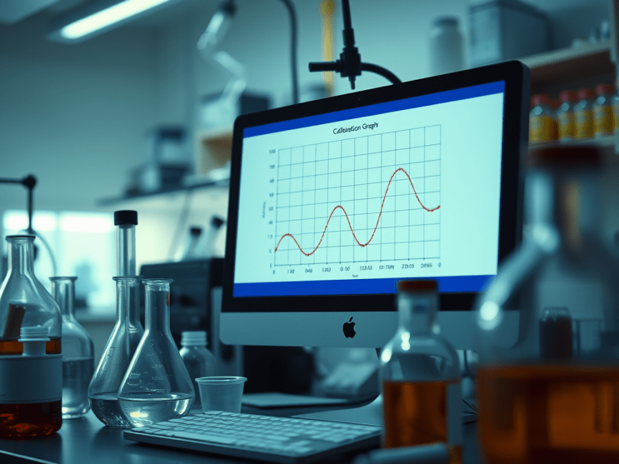
Ever wondered how chemists determine unknown concentrations in a sample? Calibration graphs come to the rescue! These graphs establish a reliable relationship between a known standard (often concentration) and a measured response (e.g., absorbance in spectroscopy). By plotting this relationship and fitting a line or curve, we can make predictions. We can predict the unknown concentration of a sample based on its measured response.
Excel vs. Python: Streamlining the Journey
While Excel can be used for calibration graphs, Python shines in automating repetitive tasks, saving you precious time and effort. With Python, you can efficiently analyse data, fit curves, and create professional-looking graphs – all in one go!
Embracing Python with Colab:
Colab is a fantastic platform for exploring Python without installing anything on your computer. Just follow the link below and create a free account to access a virtual environment pre-loaded with Python libraries:
The Code Unveiled: A Glimpse into Automation
The provided Colab notebook demonstrates how Python can handle both linear fitting (for straight-line calibration graphs). It can also handle non-linear fitting (for more complex relationships). Here’s a simplified breakdown of the key steps:
- Import the Essential Tools: Python offers powerful libraries like NumPy for data manipulation and Matplotlib for creating visualizations. The code will import these libraries to get started.
- Data Preparation: You’ll need to load your calibration data, which typically consists of two lists or arrays – one containing your known concentrations (x-values) and the other containing the corresponding instrument responses (y-values).
- Fitting the Data: Based on the data’s visual trend, the code might use
numpy.polyfitfor linear fitting orscipy.optimize.curve_fitfor non-linear fitting. These functions calculate the best-fit line or curve that aligns with your data points. - Visualization is Key: Matplotlib comes to the rescue again! The code will create a visually appealing calibration graph, including data points, the fitted line or curve, and relevant labels for both axes.
Beyond the Code: Exploring Advanced Applications
This blog serves as a springboard for your chemistry and data analysis journey. Here are some additional areas you can explore:
- Error Analysis: Uncertainty is a part of any measurement. Explore techniques to calculate and interpret the uncertainty associated with your fitted model.
- Data Validation: Ensure your data is reliable by implementing checks for outliers and inconsistencies.
- Customization for Different Models: The provided code can be a foundation. Explore fitting more complex models (e.g., polynomial or exponential) if your data deviates from a straight line.
Embrace Efficiency: Automate Your Calibration Graphs
By utilizing Python’s capabilities and the free resources of Colab, you can efficiently construct and analyze calibration graphs, freeing yourself from tedious calculations and repetitive tasks. Let the world of Python guide you towards more efficient and insightful chemistry experiments!
Feel free to leave comments below if you have any questions about the code or calibration graphs in general. Happy coding and happy chemistry explorations!

Leave a comment